Nexthink Portal V6
A friendly environment dealing with heavy data.
Visual identity / user experience / product design

Portal - along with Finder - form the core of the Nexthink software. It's proposal is to be a friendly and less technical environment.
Custom dashboards

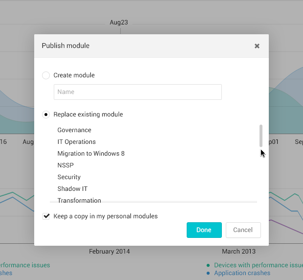
Users can build their own Dashboards that consolidate and compare live and historical data. They are fully customizable by widgets and can be edited in real time.
Widgets
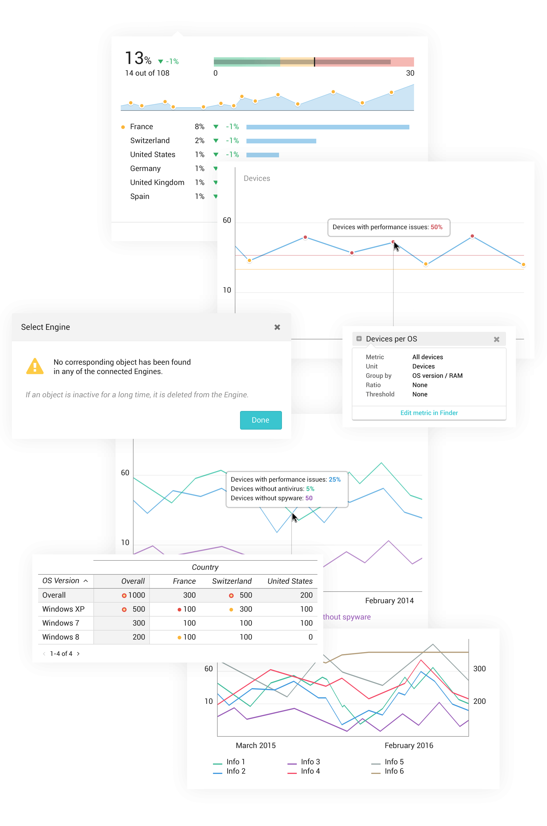
Widgets are the components that give different functions to the dashboards. There are many types: tables, metrics, line charts, bubble charts, Gantt charts, and more.
Interaction examples

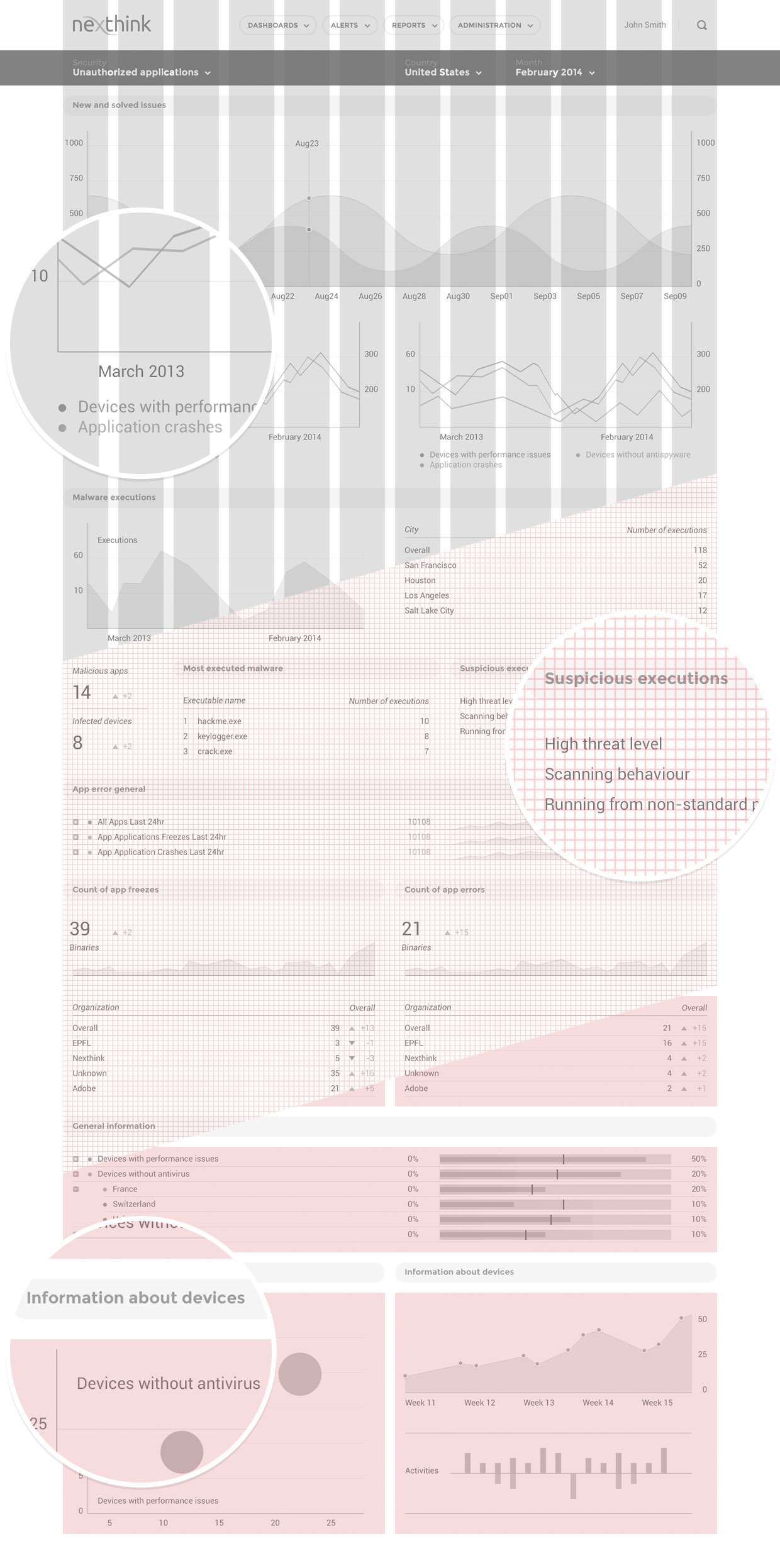
By the use of intuitive interactions, we help users achieve their goals faster and naturally.
With a high density of information in the screen, we had to minimize the addition of new elements, but at the same time making them easy to be discovered.
As an example, the addition of a scroll bar that appears once the cursor is over the area, with dynamic shadows used to give a sense of depth.

Feedback had to be displayed in real-time, and behavior patterns were created to accomplish that.
Visual elements
Grid
The grid has 12 columns of 72 pixels and uses a gutter of 16px between each column. All components align to an 8 pixels square baseline grid. Type aligns to a 4 pixels baseline.
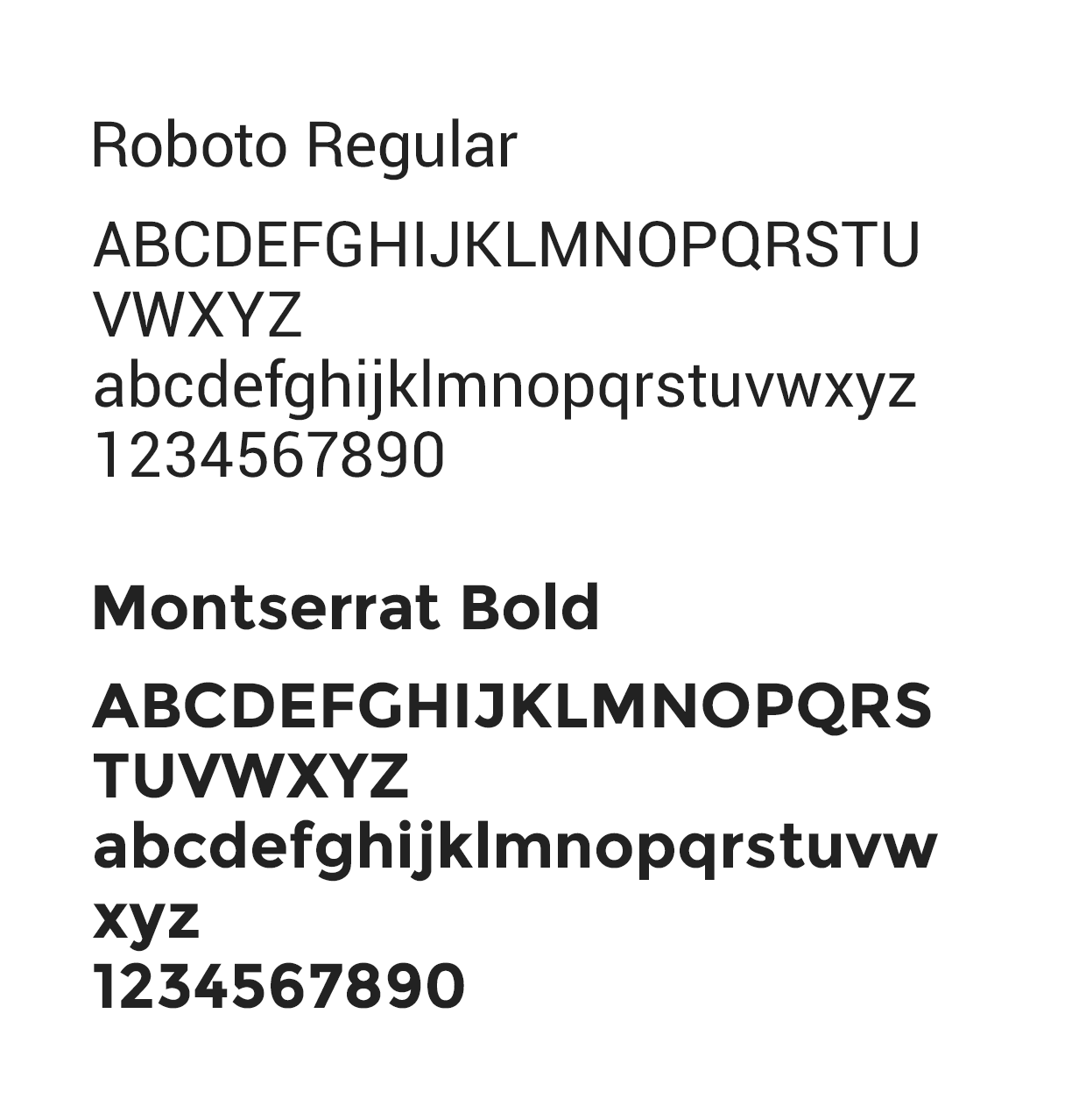
Typography
We have to use open-source fonts, and Roboto was my choice. Slightly condensed, it works pretty well in small sizes, to display dense data, in tables, and graphs. For titles, I have chosen Montserrat.

Color palette
Colors need to carry meaning in some situations - in others don't. So a palette was created having that in mind. For example, a hue of blue and green should communicate something without saying it's good or bad. And in other scenarios, green (good) and blue (neutral) have to co-exist with red (bad) and yellow (attention).
Components

Navigation
Header interactions

Datepicker

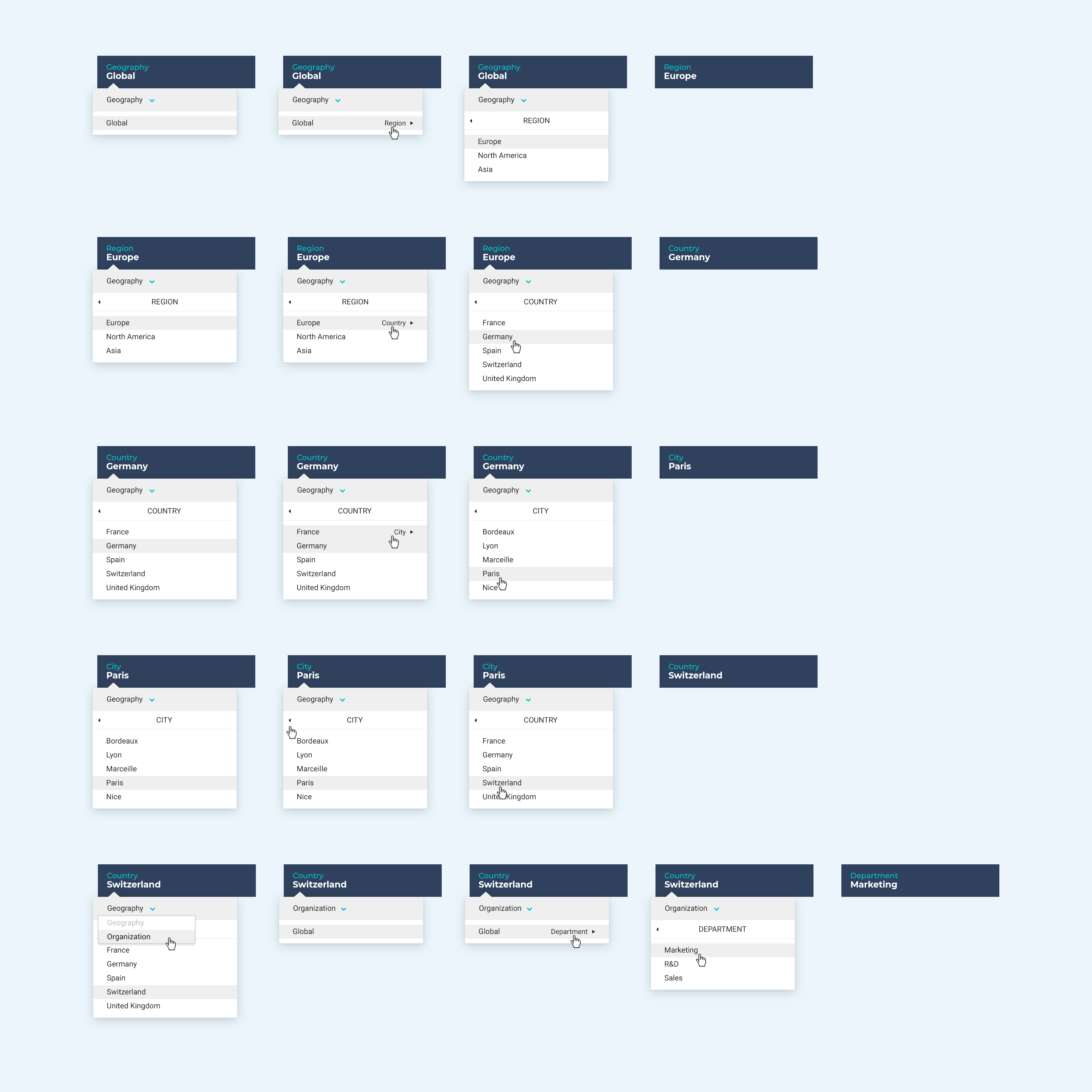
Geo location