Nexthink Experience
The next step in Nexthink's evolution into a cloud platform.
2020 / Visual identity / user experience / product design

Nexthink Experience represented a new stage for the product. The platform was moving to the cloud, becoming more modular, and serving a much broader set of use cases.
About the project

Nexthink Experience brought several capabilities that had previously lived in different parts of the product into a more consistent cloud experience.
he challenge was no longer just making complex data easier to understand. The product itself was becoming larger, with more features, workflows and different types of users.
My work focused on the interface, interaction patterns and components that helped those different parts feel like they belonged to the same product.
Components


Interaction examples
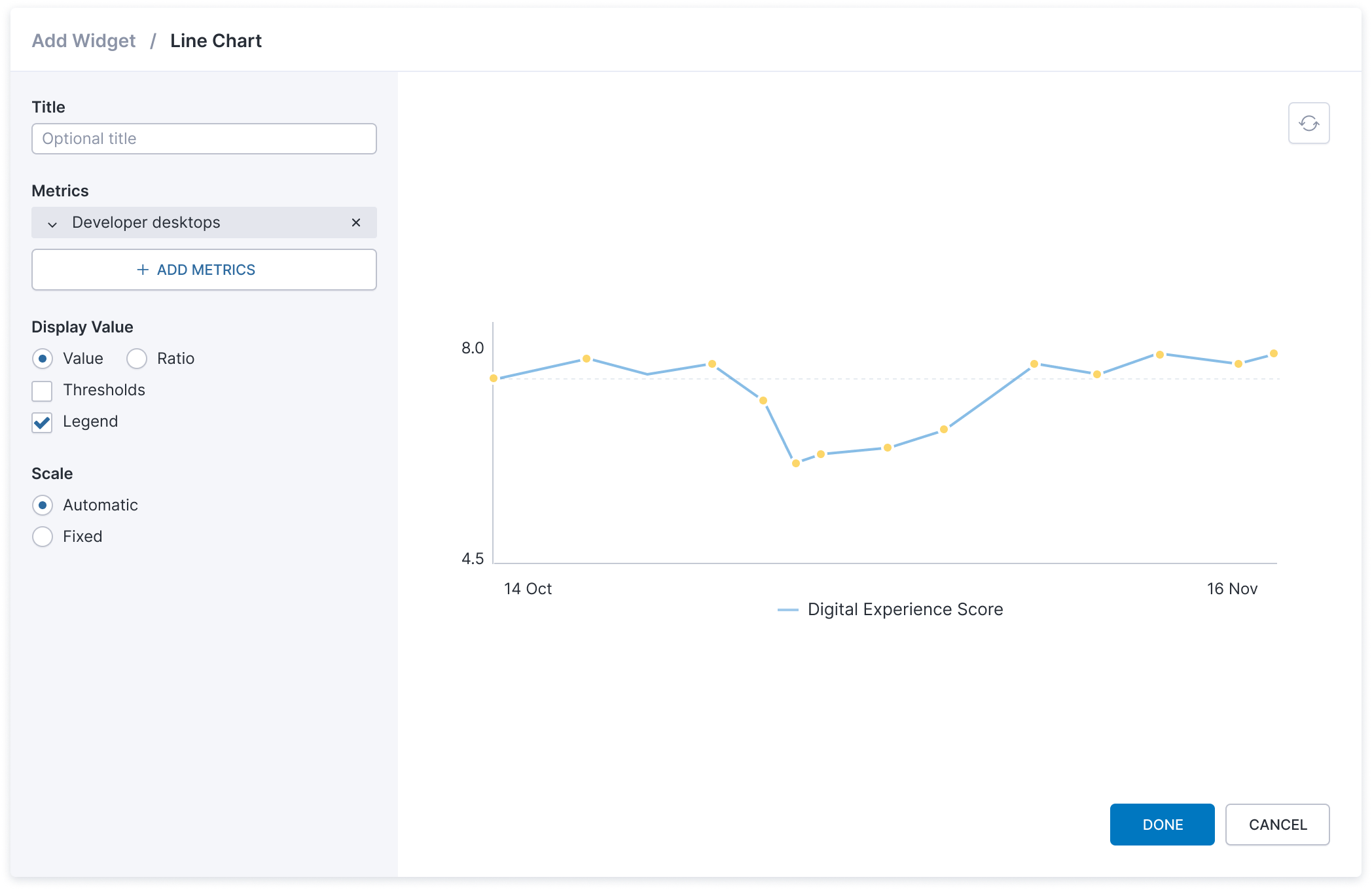
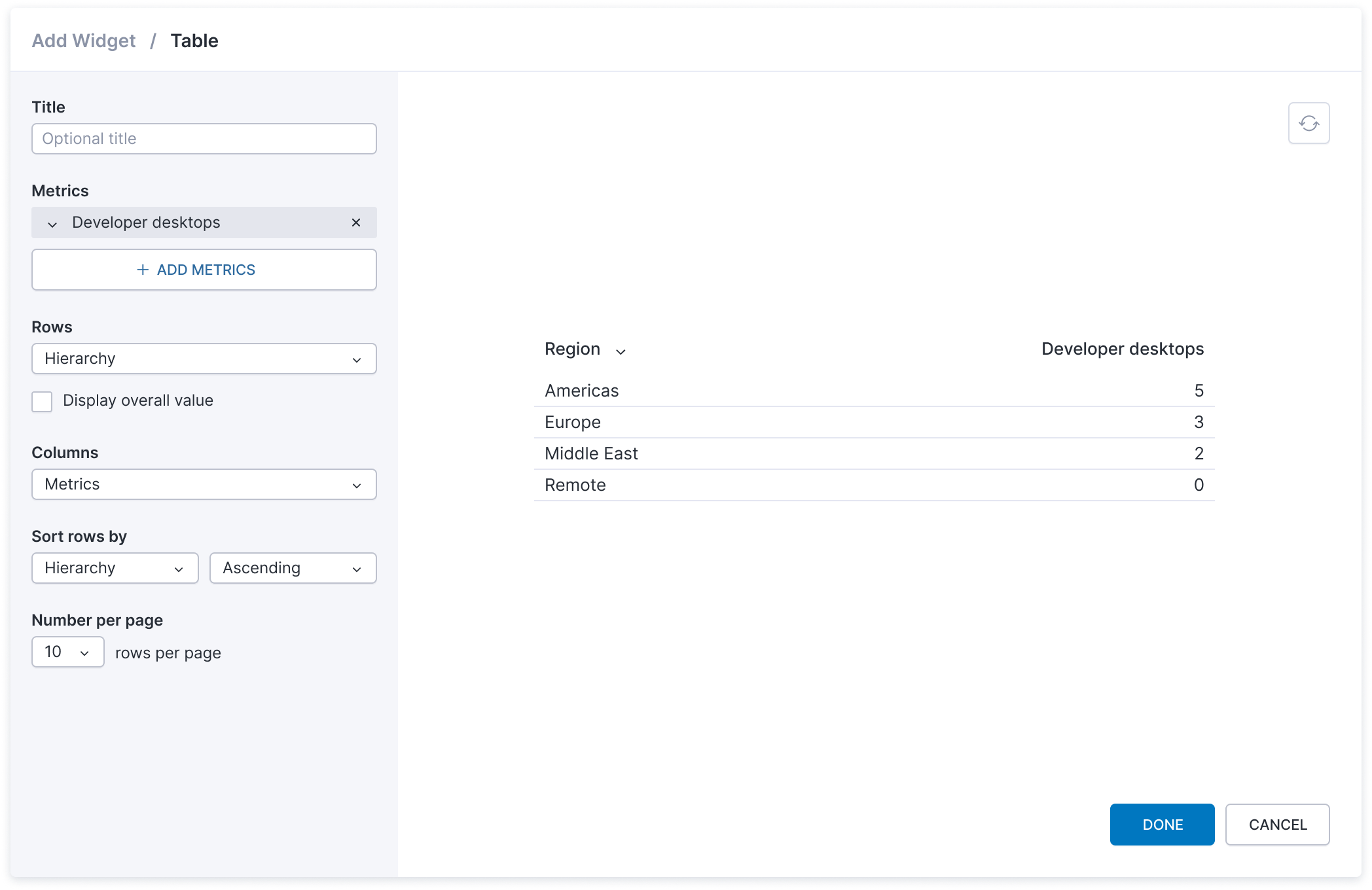
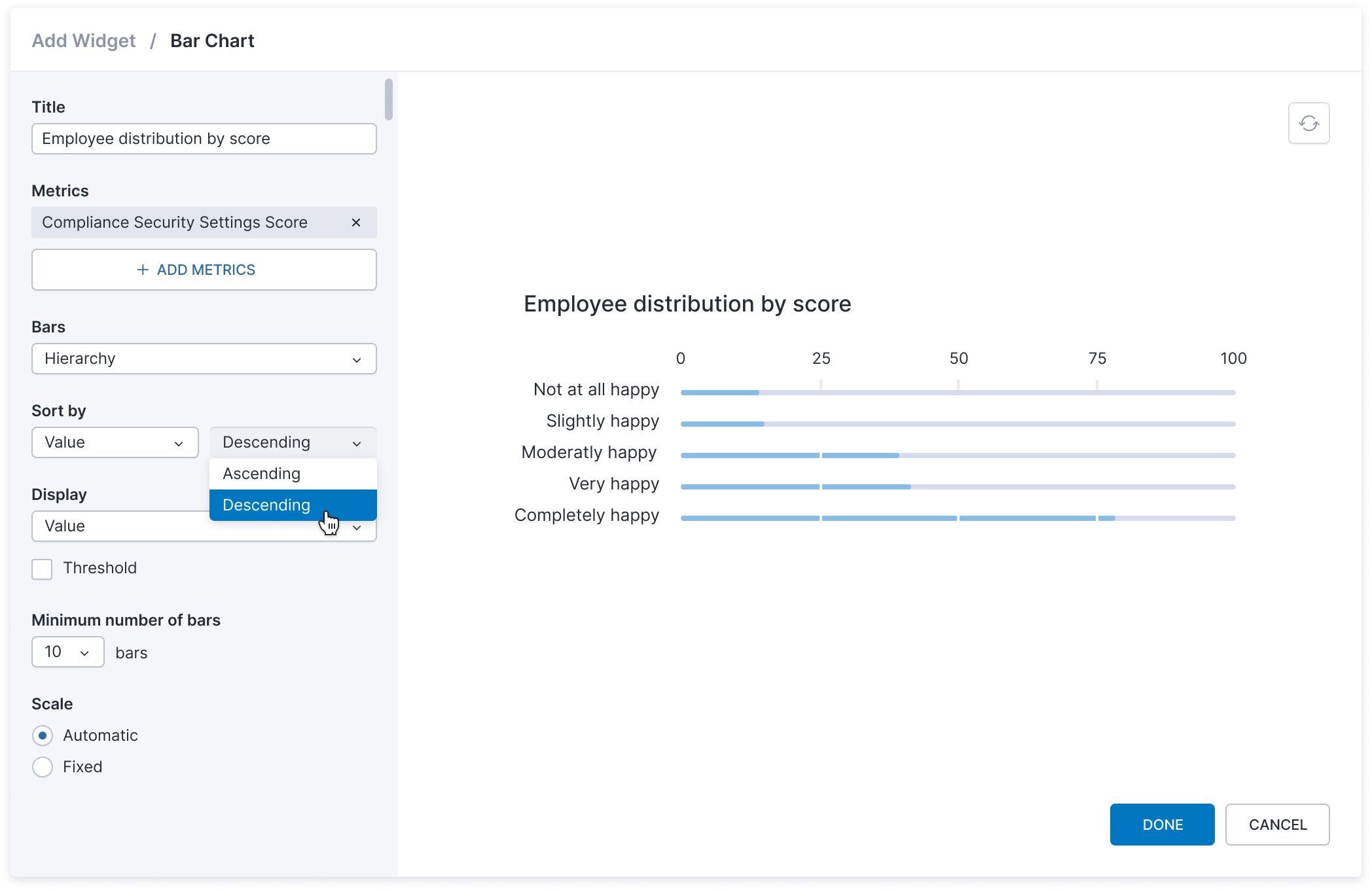
Adding widgets to dashboards

One small, complicated problem
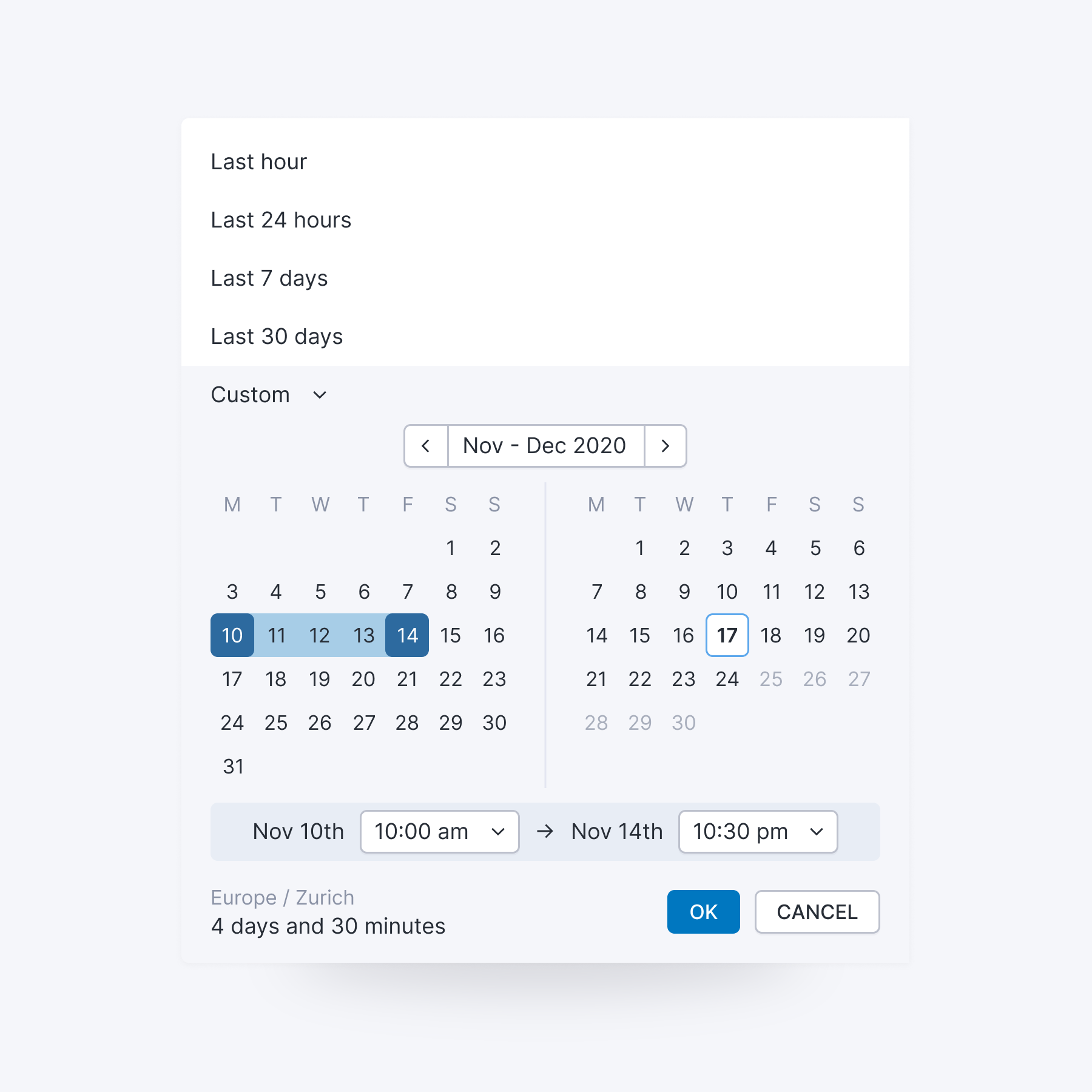
Choosing different time ranges

Time is fundamental to almost everything in Nexthink. What looks like a simple date picker had to support fixed dates, relative periods and comparisons while remaining predictable across the product.
"We had a lot of perception feedback from our end user, this is slow, this is not working, this is crashing. But we were never able to understand the real condition on the PC."
Arnaud Pie
Toyota Motor Europe
Dark mode
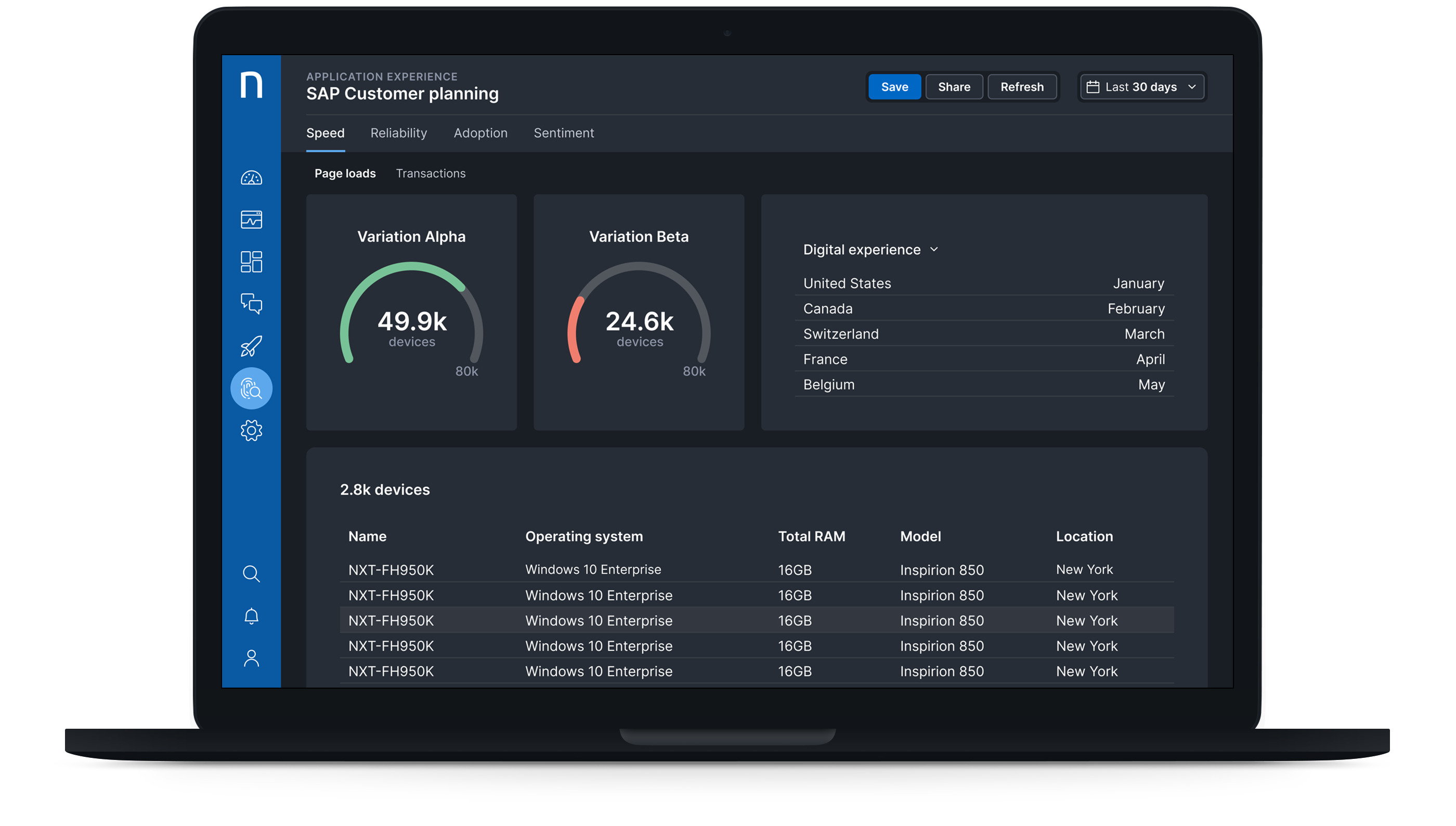
Dark mode wasn't simply a matter of reversing colors. Charts, status colors, tables and dense data visualizations all had to remain readable without changing their meaning.
It also pushed us to think about color more systematically. The interface needed to work as a system in either environment, rather than treating dark mode as a separate skin.
Used by companies around the world