Nexthink Redesign & System

Rebuilding the foundation of a complex product.

The previous design system had become disconnected from the product's evolution. I saw the need for a new system and took ownership of designing and building it from the ground up.

Nexthink had evolved significantly over the years. The product had become more capable, more complex, and more data-rich, but its visual language hadn't evolved at the same pace.

The challenge wasn't simply to make the interface look newer. It was to create a system that reflected what the product had become while giving it room to evolve further.

Working with what already existed

One of the biggest challenges was making the new system work with a product that had been built over many years. I couldn't replace everything at once. The system needed to introduce a new visual and interaction language while still working within existing patterns, components and constraints.

The goal wasn't to erase what existed.
It was to give the product a way to move forward.

A quieter foundation

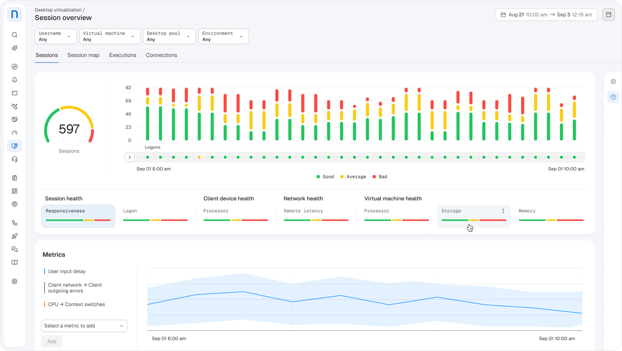
Nexthink interface showing the quieter visual foundation

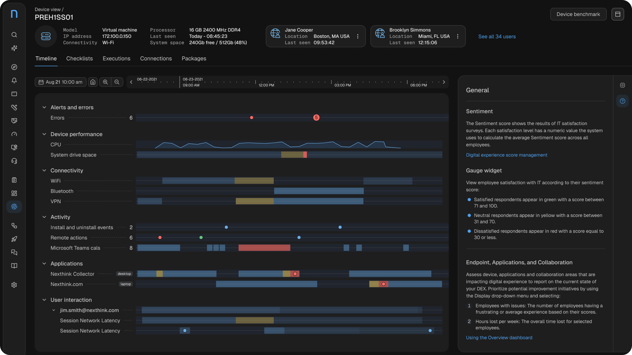
Nexthink is a data-rich product. Dashboards, tables, KPIs, charts, gauges and controls often compete for attention on the same screen.

As the product became more complex, the interface around that information needed to become quieter rather than more expressive. I reduced the reliance on color and visual decoration in the structural UI, allowing typography, spacing and surfaces to establish hierarchy instead.

This also gave color a more meaningful role. Rather than appearing everywhere, it could be reserved for actions, states, focus and, most importantly, the data itself.
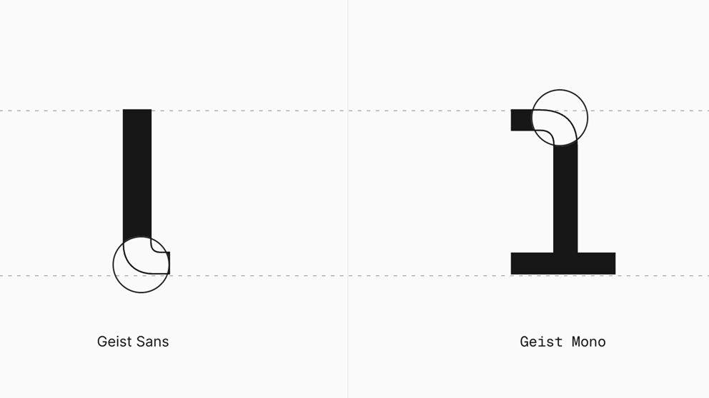
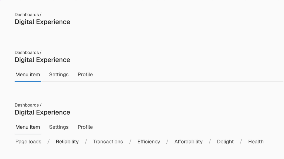
Typography study

Typography

The typography was refined to give the interface a clearer and more distinctive character. A monospace variant was introduced for selected interface elements, creating separation and a more technical feel without relying on heavier weights or additional colors.

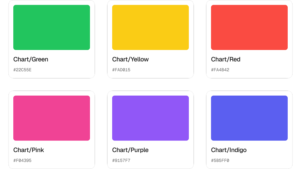
Color system study

Color

The color system was simplified and made more intentional. Hundreds of tokens were consolidated into a smarter structure, while muted colors added flexibility for dashboards and containers. The palette was also designed to work more consistently across light and dark modes, with clearer distinctions for accessibility.

Surfaces and spacing study

Surfaces & spacing

The interface was given more room to breathe by relying less on borders and more on spacing, surfaces and subtle separation. The result was a lighter visual structure that could handle dense product experiences without turning every element into a box.

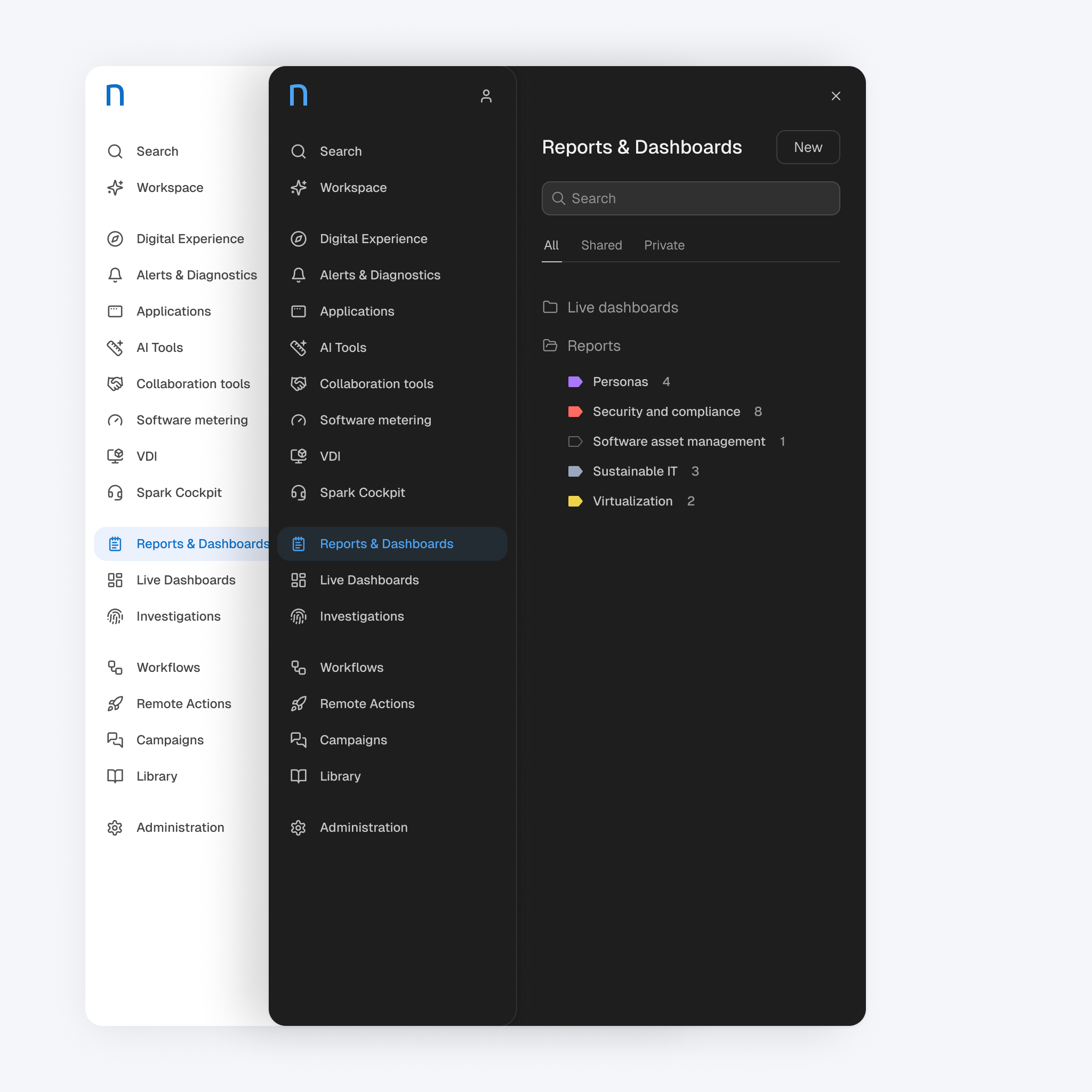
Simplifying navigation

Nexthink navigation redesign

Navigation had accumulated a lot of visual weight over time. I explored ways to make it lighter without losing the complexity the product required.

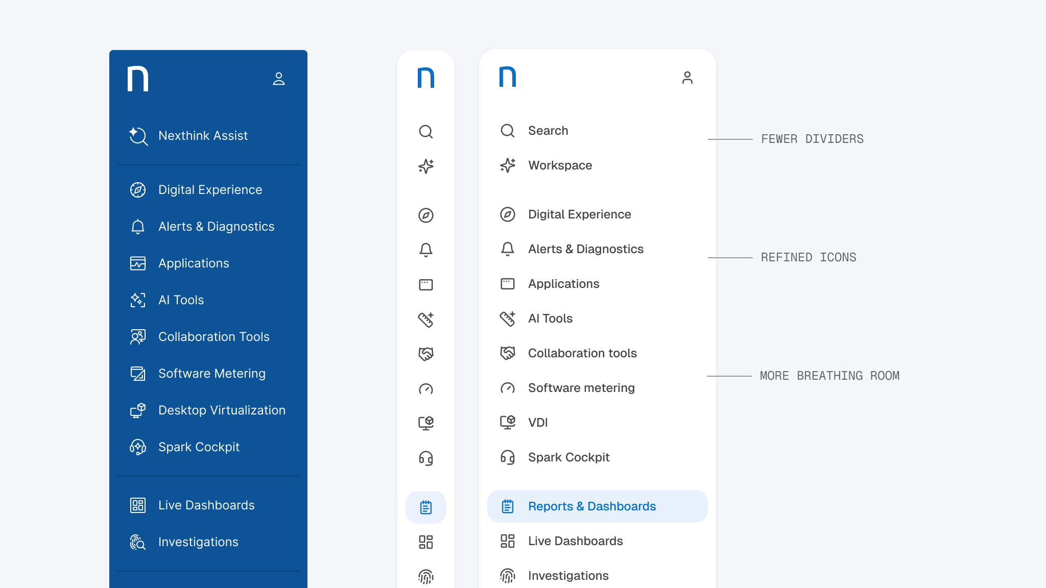
Icons were simplified, separators removed and spacing adjusted. I also experimented with a slimmer menu and with reducing the amount of persistent navigation shown on screen.

Navigation explorations

The blue navigation presented an interesting trade-off. A neutral version felt more elegant and better aligned with the quieter foundation, but the association with Nexthink's brand remained important. I ultimately kept the blue, refining its hue, proportion and relationship to the rest of the interface.

Designing for the real data

Nexthink charts and data visualization work

Designing a chart in isolation is very different from designing one for real customer data.

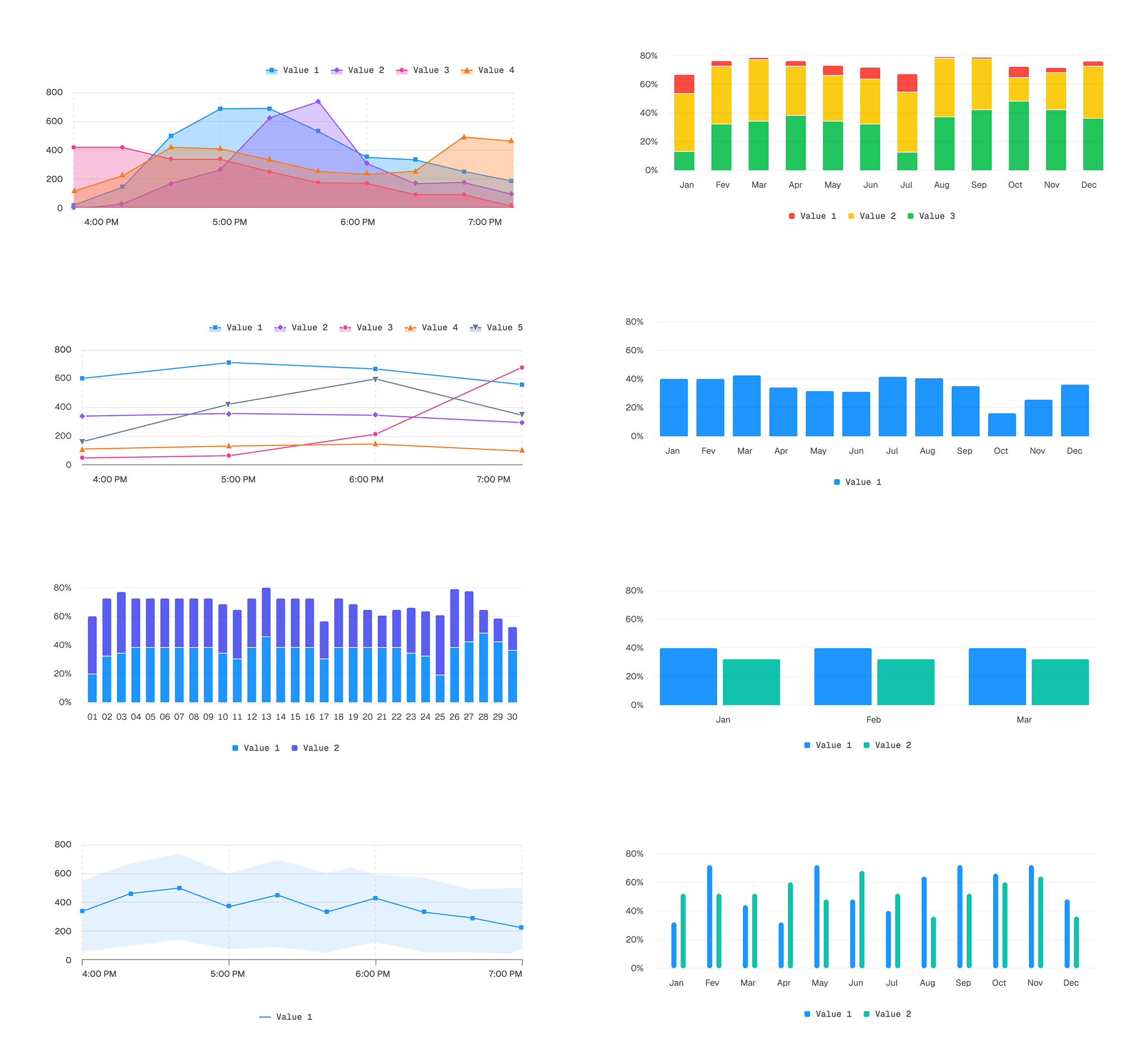
Some of the earlier charts looked perfectly reasonable in Figma but fell apart when populated with real information. A line could sit almost invisibly near the x-axis, or a chart could technically contain data while communicating almost nothing.

The chart system was redesigned around those realities. Components became more flexible, with options for legend placement, axis position, grid lines, muted or brighter palettes and additional visual cues such as shapes. The goal was to make the system work with the variability of real data, rather than forcing real data into an idealized component.

Nexthink dark mode data-rich screen

A system should help, not get in the way

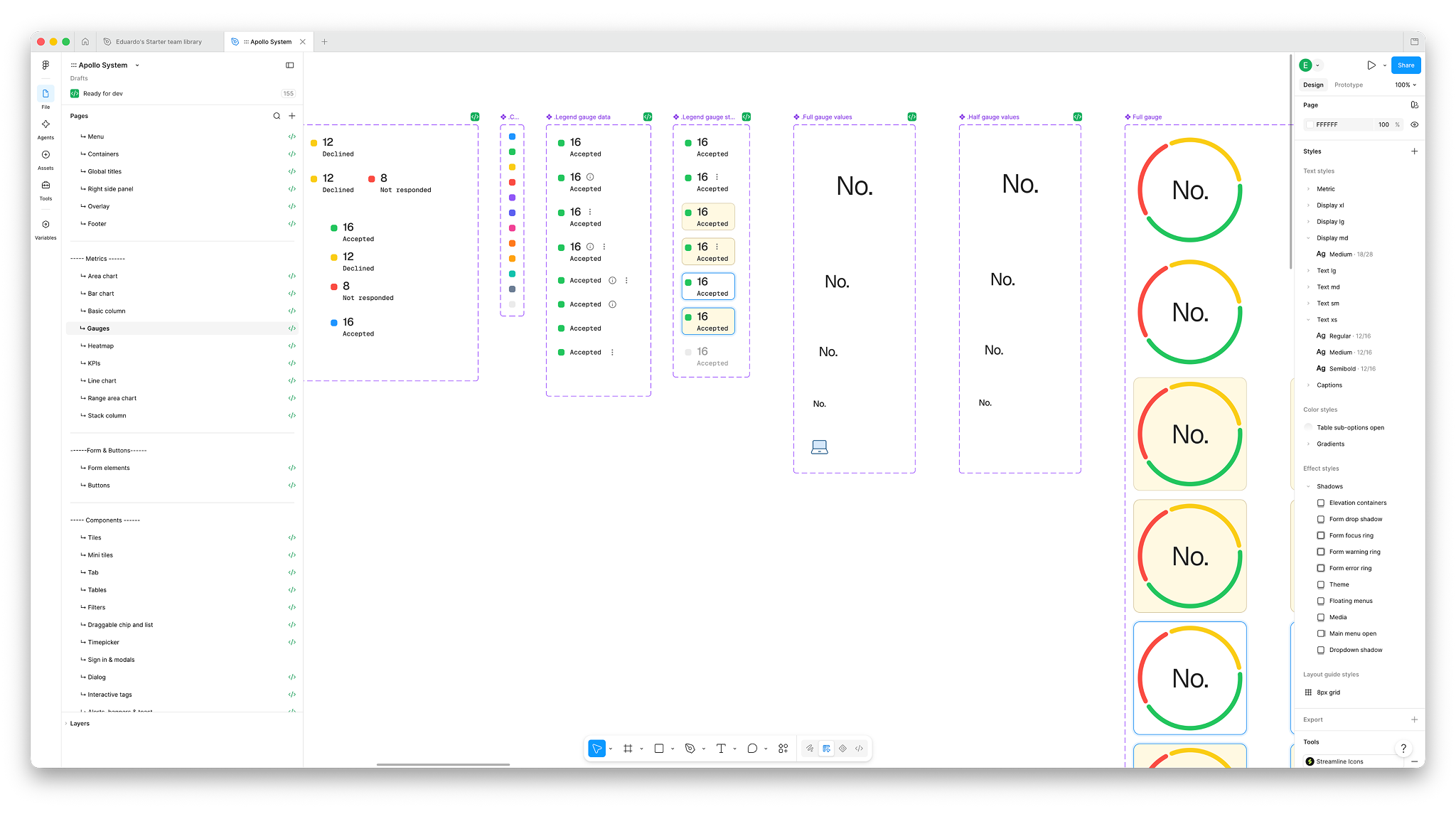
Nexthink design system components in Figma

A design system is only useful if it supports real design work.

In practice, some existing components had become restrictive enough that designers were working around them or creating ad hoc solutions. I expanded the system with more meaningful variations and states, particularly for complex components such as charts, gauges and tables.

The goal wasn't to create more options for the sake of it. It was to make common scenarios easier to solve without fighting the system.

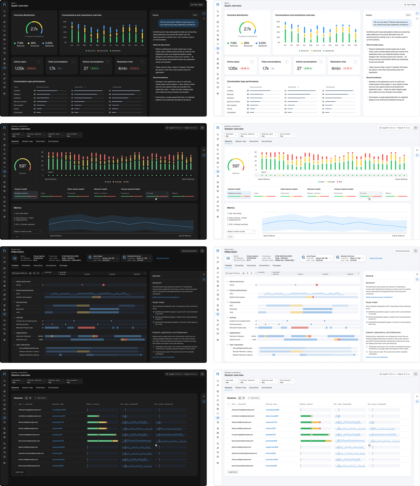
Nexthink product screens using the design system

The system was designed to disappear into the product.

Its job wasn't to make every screen look the same, but to give the product a common visual and interaction language as it evolved.

Evolution, not reinvention

The system wasn't about making Nexthink look like another SaaS product. It was about giving a more mature product a visual language that could keep evolving with it.

A quieter foundation brought more clarity to everyday experiences, while leaving room for data, AI and brand expression to become more distinctive when they mattered.