Nexthink Portal V6
Making a data-heavy enterprise product easier to understand.
Portal democratized Nexthink's data through configurable dashboards that required no technical knowledge. I designed the product's visual and interaction language, establishing components, typography, and navigation patterns that would scale the product.
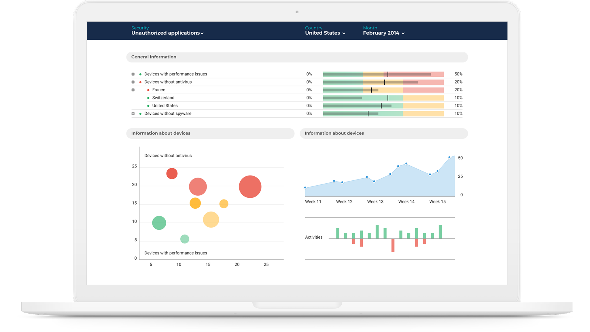
Custom dashboards
Nexthink collects an enormous amount of information. The challenge wasn't giving users access to more data. It was helping them decide what deserved their attention. Dashboards could be assembled from reusable widgets and adapted to different roles and needs, while still behaving as part of the same system.
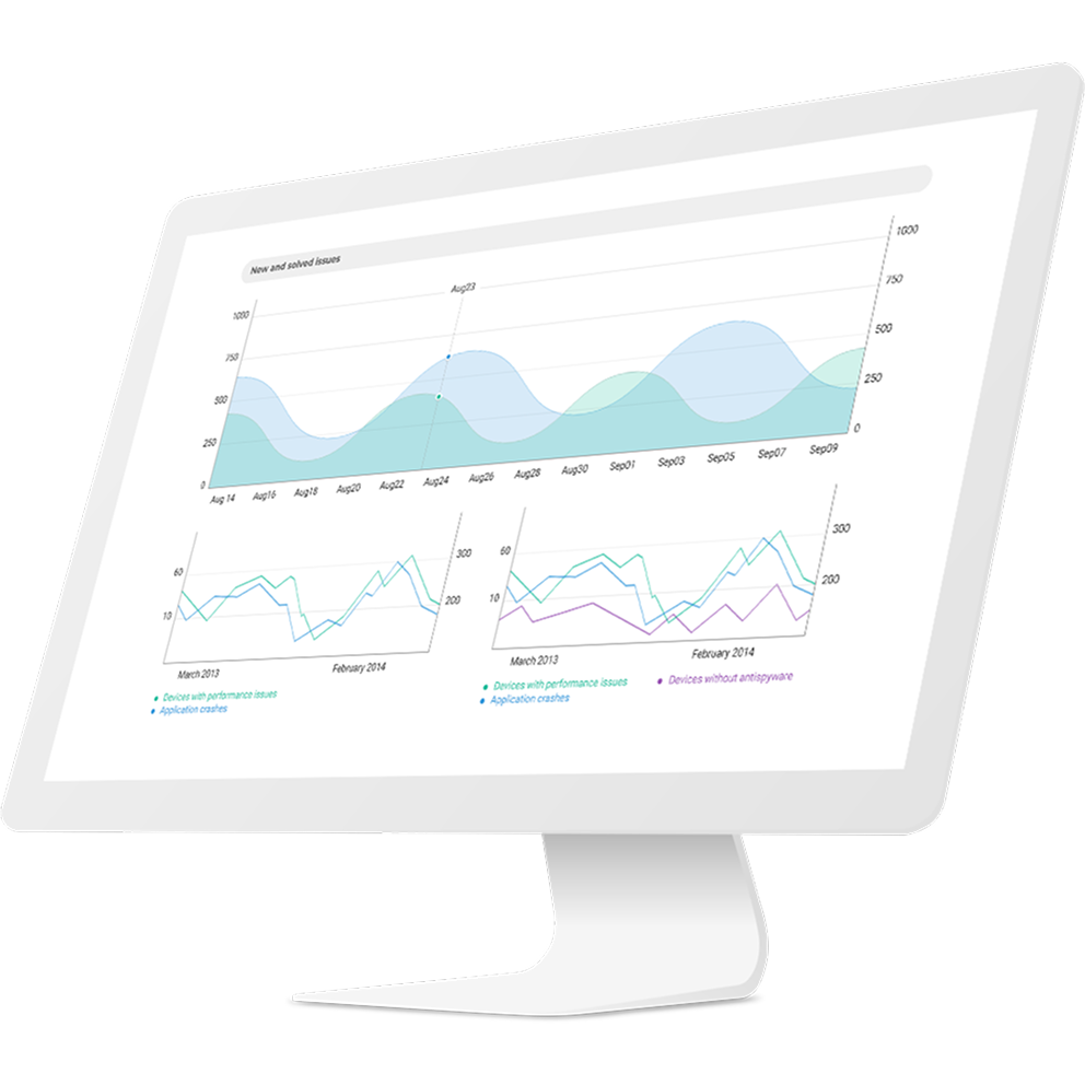
Widgets
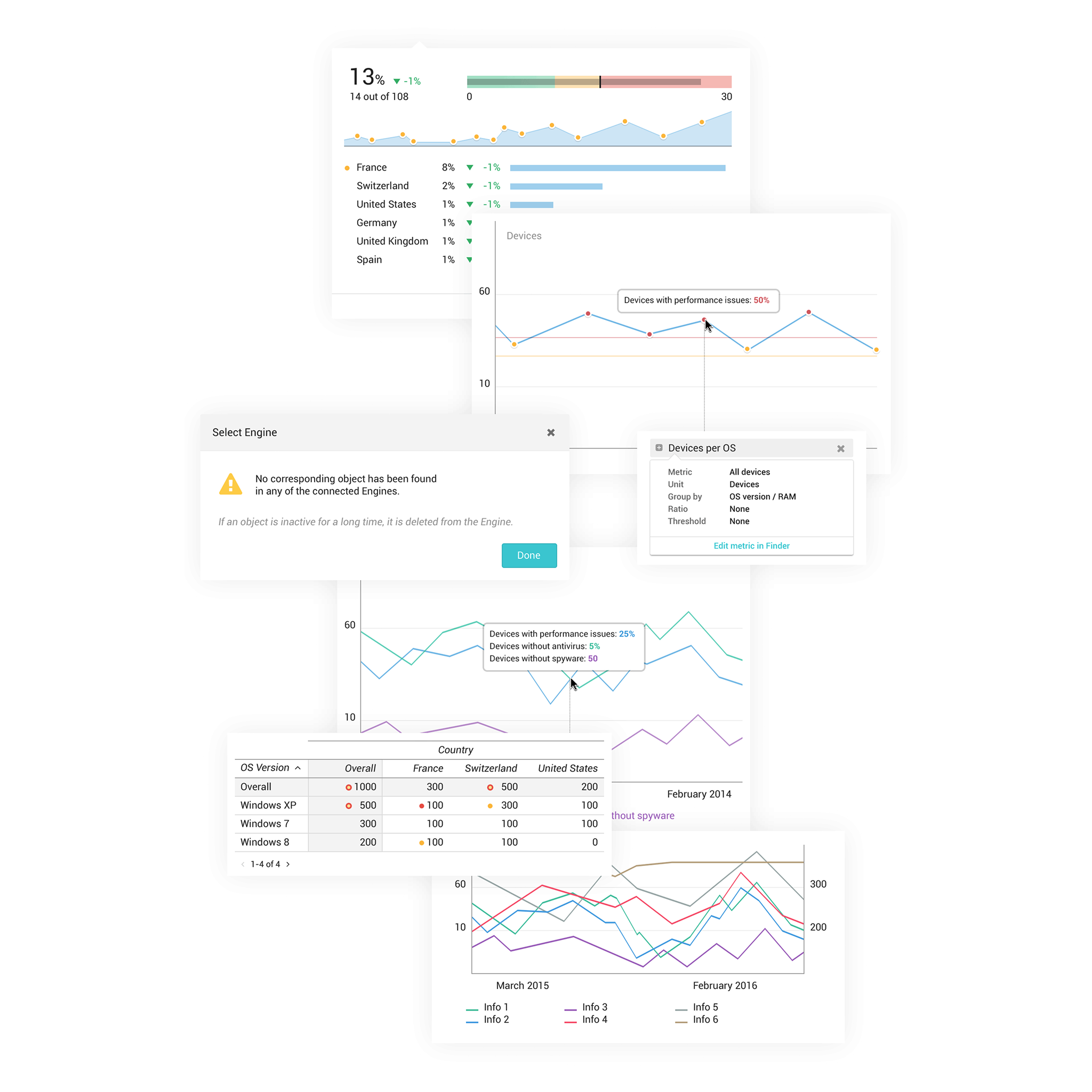
Widgets became the basic building blocks of Portal. They needed to accommodate very different kinds of information - trends, distributions, comparisons, alerts and detailed tables - without every new use case becoming a new design problem. The goal was consistency without forcing very different data into the same shape.
Interaction patterns
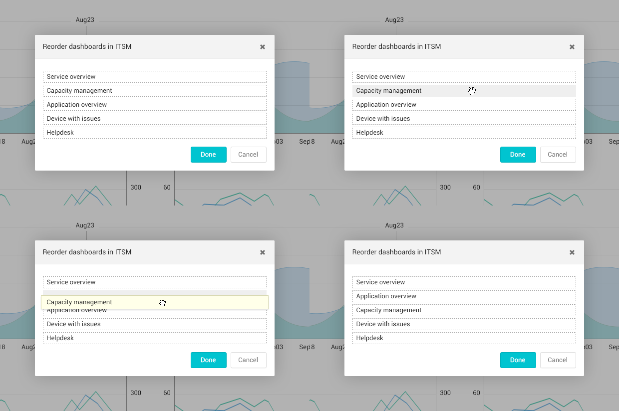
Some interactions only appeared when they were needed, keeping an already dense interface from becoming even busier.
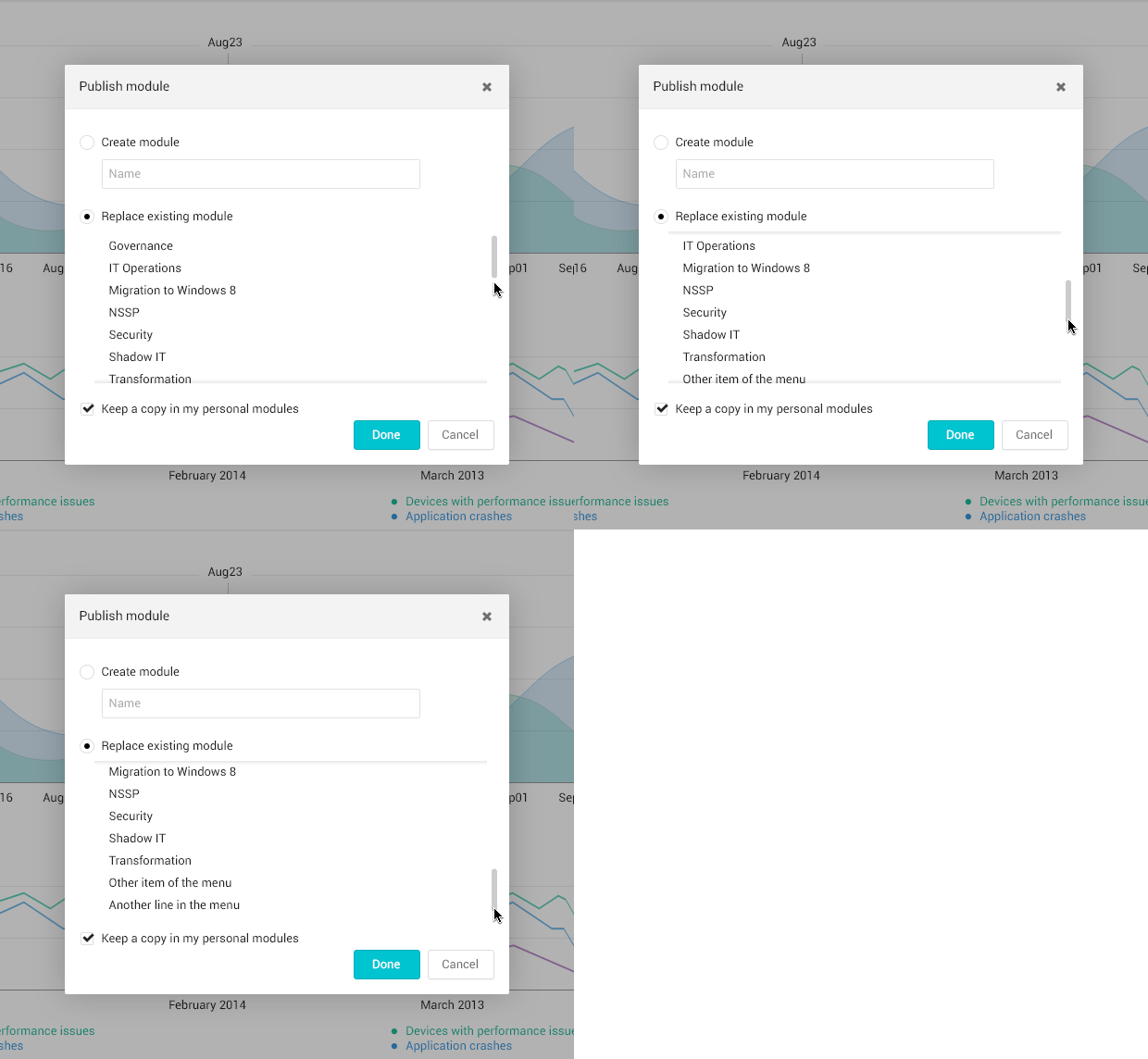
Small details helped make complex screens easier to use. We tried to keep interactions close to the content they affected. Controls could appear on hover, scrollbars stayed out of the way until needed, and subtle shadows helped communicate depth and movement without adding more permanent elements to the screen.
Foundations
Grid
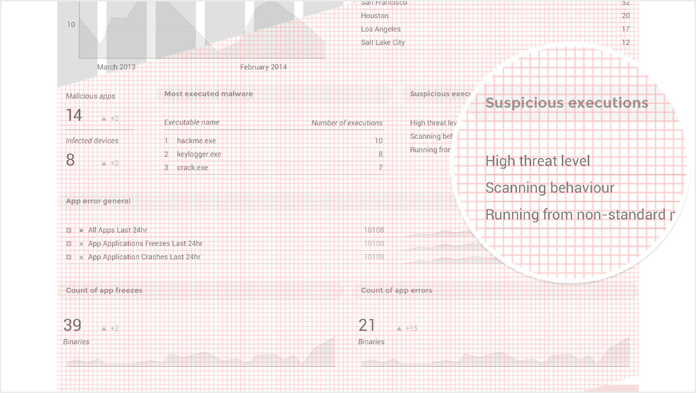
Enterprise products accumulate information quickly. The grid gave us a predictable structure for dense screens while allowing dashboards to accommodate very different combinations of content.
Color
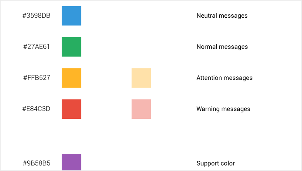
Color wasn't primarily decorative. Much of it carried meaning - status, severity, categories and data relationships - so the palette had to remain useful across dashboards rather than just look coherent on an individual screen.
Reusable patterns
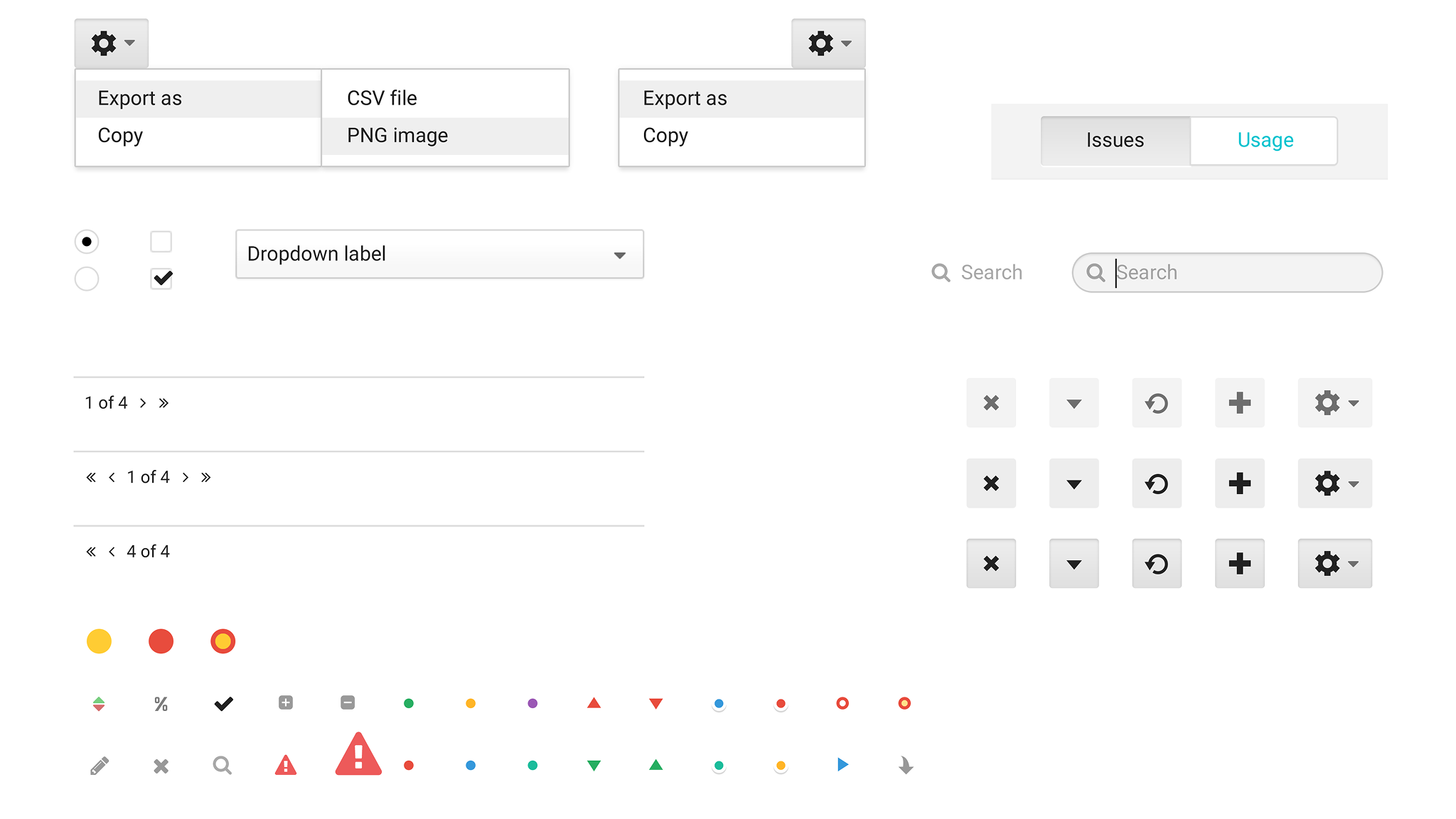
As the product expanded, repeating basic interface decisions stopped making sense. Common controls and behaviors became a shared vocabulary that made new features faster to design and, more importantly, made the product more predictable to use.
Navigation
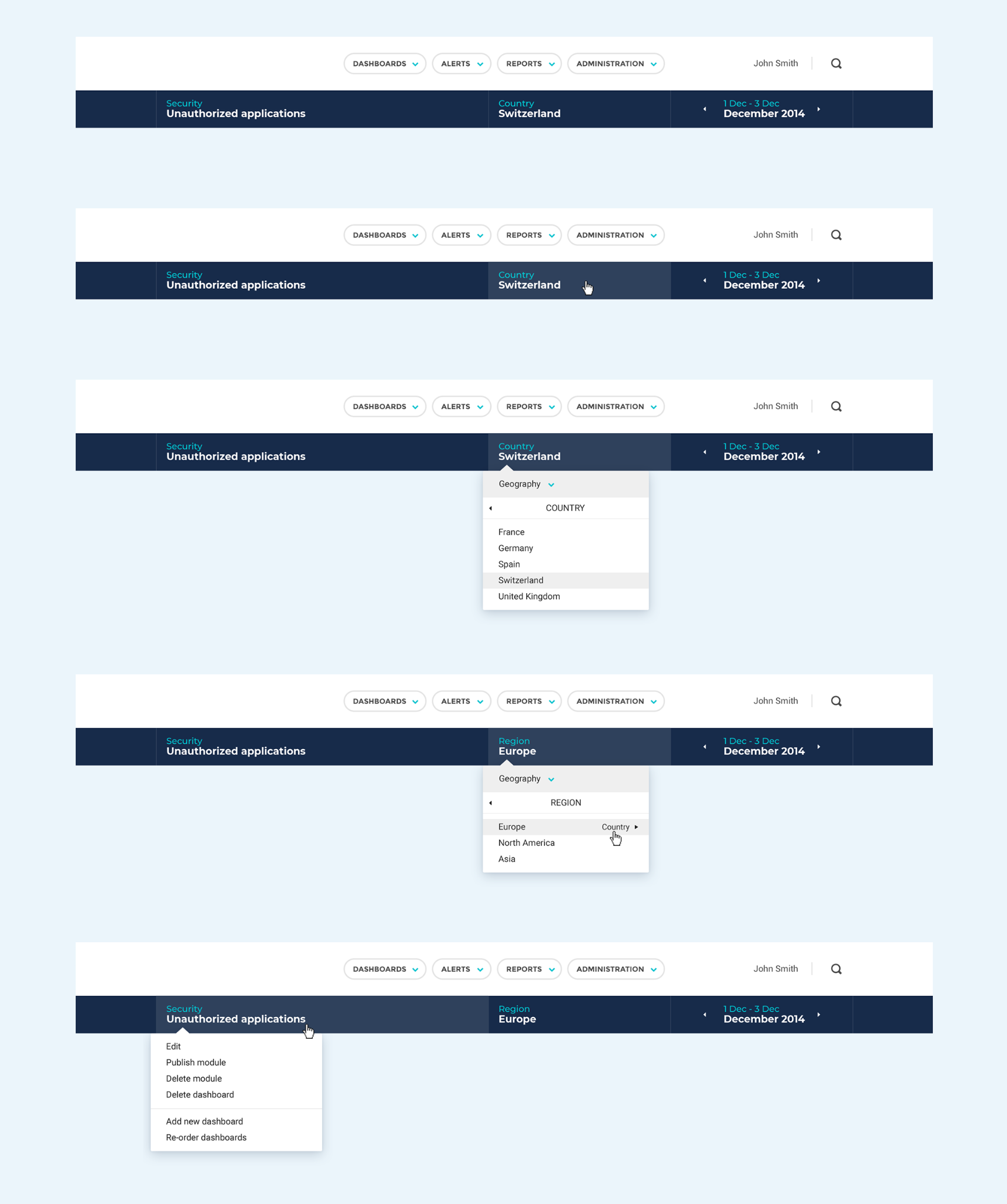
Some of the hardest problems were mundane ones. Date ranges, locations and navigation sound simple until they have to work across an enterprise product with many contexts and large amounts of data. I spent a lot of time on these details because they affected almost everything built on top of them.
Not everything worked
Nexthink was still very much an engineering-led company, and the platform we were building on wasn't particularly flexible, and in some ways, it was already showing its age. Visual alignment between widgets was a constant struggle. Some areas became extremely dense with information, while others could feel almost empty when there wasn't enough data to fill them. And then there was whitespace. We had an ongoing debate about how much breathing room the interface could afford. I often found myself making the case that empty space wasn't wasted space and it had a job to do.
What survived
This was the first time at Nexthink we really thought about design as a system rather than a collection of screens. The product has changed a lot since then, but some of the thinking survived. Grids, information density, reusable patterns, and the need for a consistent language became part of the DNA of what Nexthink would eventually become.